Data visualization is the representation of information and data using charts, graphs, maps, and other visual tools. These visualizations enable data professionals to quickly understand a dataset's patterns, trends, or outliers. Data visualization also presents data to the general public or specific audiences without technical knowledge in an accessible manner.
Data visualization can be exploratory or explanatory.
When used as an exploratory method, the data is visualized before analysis to focus attention on the aspects of the data needing further investigation. Visualizing your data allows you to identify potential problems or opportunities in the data set, and it can also help with data cleaning and preparation by identifying missing values, outliers, or other issues.
When used as an explanatory method, data is visualized after analysis to communicate your findings and insights to your audience. Explanatory data visualization can help with decision-making by presenting complex information in an easy-to-understand format.
Data visualization helps the human brain process complex data sets more easily and effectively. Visualizing your data also allows you to think differently about the data and see patterns that may not be apparent with descriptive statistics alone.
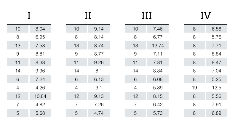
Data viz practitioners often point to Anscombe's quartet as an example of how visualizing a dataset provides insights that may not be readily apparent through descriptive statistics.
The dataset contains four groups (I, II, III, IV), each with X and Y properties, as seen in the table below.

When analyzed using simple descriptive statistics, one might conclude that the groups are quite similar based on the following calculations:
Group I, Group II, Group III, and Group IV
Mean x: 9.0
Mean y: 7.5
Variance x: 11.00
Variance y: 4.13
Correlation between x and y: 0.816
Linear regression coefficients: Y=3.00+0.50X
However, when the data for each group is plotted, we immediately see that the groups have unique distributions:

Image of Anscombe's Quartet plot published under the terms of "Creative Commons Attribution-Share Alike", source: https://commons.wikimedia.org/wiki/File:Anscombe%27s_quartet_3.svg
Anscombe's table source: https://multithreaded.stitchfix.com/assets/images/blog/anscombes_quartet_table.png
Data visualizations tend to emphasize the data more than the design, but that does not mean that design is not an essential aspect of the visualization process. Data visualization aims to present the data in a way that lends itself to interpretation and further analysis. Charts, maps, and plots are all examples of data visualization.
ProPublica - Workers’ Comp Benefits: How Much is a Limb Worth?
The Pudding - Film dialogue from 2,000 screenplays, broken down by gender and age
An infographic is a graphic visual representation of information, data, or knowledge that aims to present information quickly and clearly. Infographics tend to focus on key points extracted from the data rather than the entire dataset. Infographics are commonly used to narrate a story and/or attempt to persuade the audience of a specific message or argument.
Statistics Canada - Making time for creative activities
World Bank - Infographic: What Climate Change Means for Africa and Asia
Data art is a form of art that uses data as a medium or source material to create visually appealing and meaningful representations. Data art often seeks to evoke a certain mood or emotion.
Moritz Stefaner - The Rhythm of Food
Aaron Koblin - Flight Patterns
Explore. Discover. Create.
24255 Pacific Coast Highway, Malibu, CA 90263 Phone: 310.506.7273Copyright © 2025 Pepperdine University
